User Widgets
Descope User Widgets provide self-service components that empower your end-users to manage their own profiles and authentication methods, and access their applications. These widgets enable a seamless user experience by allowing users to handle their own account settings and preferences directly within your application.
If a User Widget is hosted in the Admin Portal (for example, the Applications Portal Widget), you can restrict which users see it there by configuring required permissions on that widget.
Overview
User Widgets are designed to give end-users control over their own data and access:
- User Profile Widget: Enables users to manage their personal information, profile pictures, and authentication methods like passkeys, passwords, and TOTP.
- Applications Portal Widget: Provides users with a personalized dashboard of applications they have access to, allowing them to quickly navigate between different services.
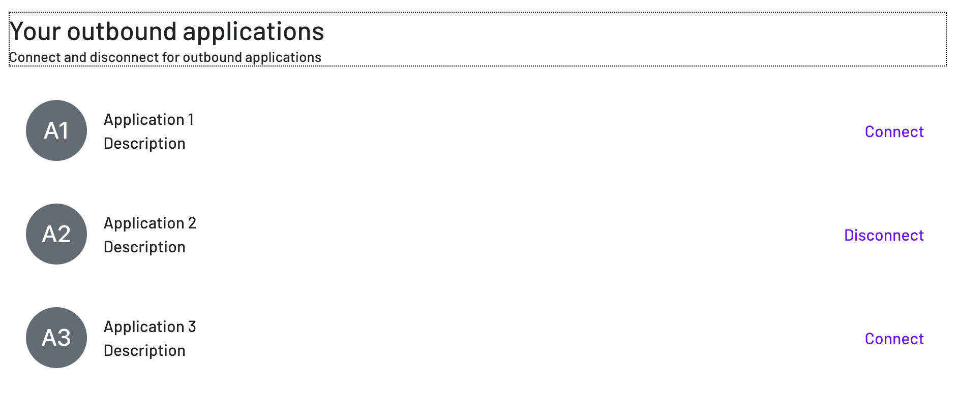
- Outbound Applications Widget: Provides users with a list of outbound applications they are managing tokens with, and allowing them to connect to each of them directly from a widget.
- Tenant Switcher Widget: Allows users who belong to more than one tenant to choose which tenant is active for their session, so tenant-scoped roles, data, and configuration apply in the correct context.
User Profile Widget
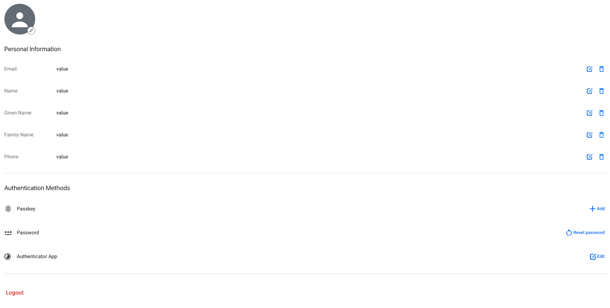
The widget enables your end users to:
- Update user profile picture
- Update user personal information (name, phone, email, given name, middle name, family name)
- Update a recovery email and recovery phone number
- Update authentication methods (passkey, password, TOTP)
- See and sign out of all trusted devices
- Logout
You can modify the behavior of the user profile widget functions by modifying the default flows for each component in the widget. You cannot, however, add custom buttons to the widget.
Note
Setting a recovery email or phone number requires the user to verify it through a confirmation link before it takes effect. Until verified, the value won't show as set. See Adding a Recovery Email for how the underlying flow works.
The onReady callback is optional and can be used to handle the widget's ready state.
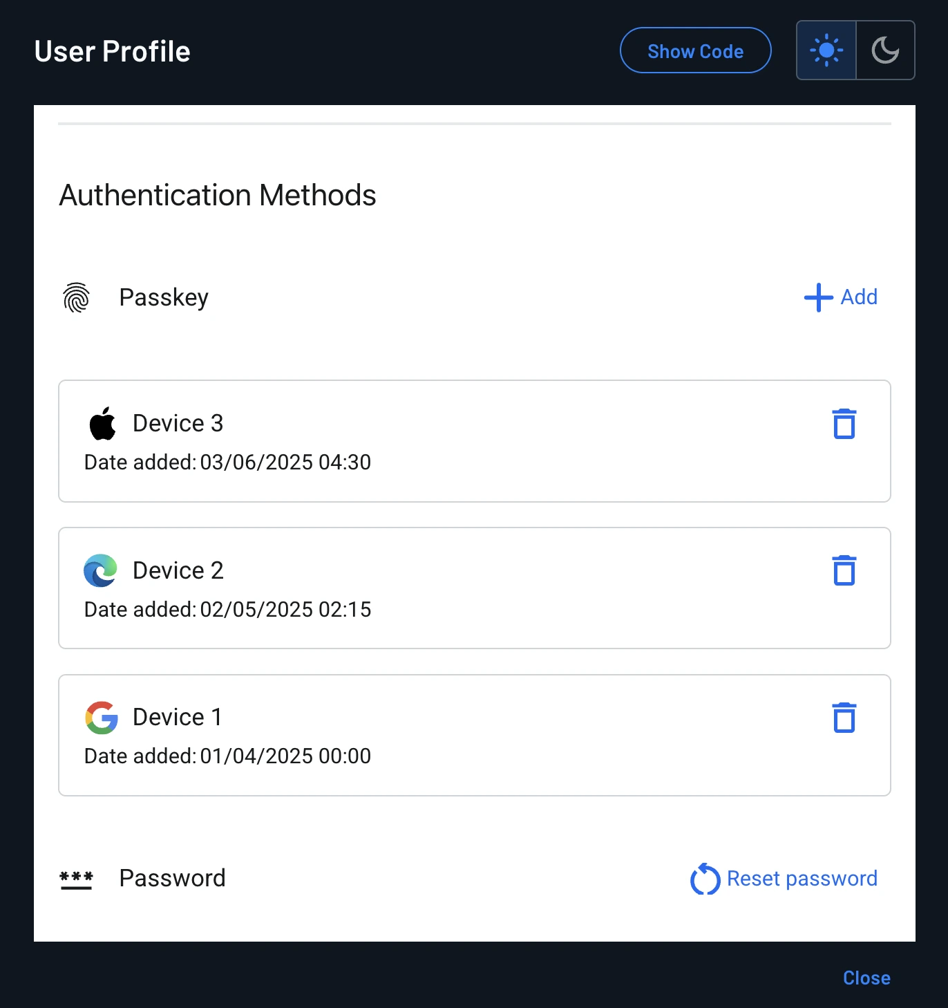
Passkeys
The widget lists all of the passkeys registered to the user's account (for example, one per device), letting users keep track of every passkey they've added.
Note
Users can only remove a passkey from the widget if that capability is enabled in the widget page's own passkey behavior settings.
Custom Action Icons
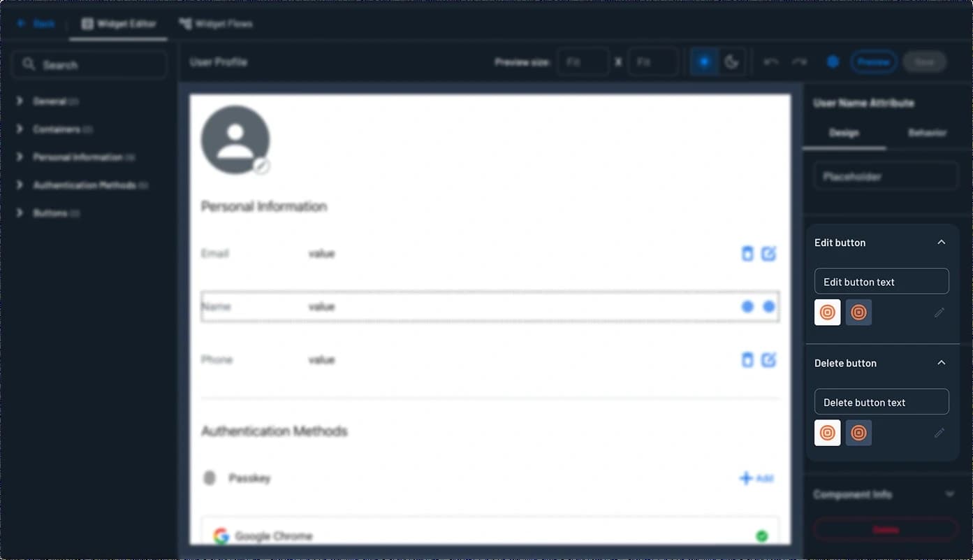
Each attribute row in the User Profile Widget uses Descope's default icons for its Edit and Delete buttons. You can override these with your own icons on a per-attribute basis (for example, using different icons for Name than for Email) from the widget editor's Design tab.
- Open the User Profile Widget in the Console, select the attribute row to customize, and go to the Design tab.
- Expand the Edit button or Delete button accordion (they're independent, so you can customize one without the other).
- Click the pencil icon, then upload a custom icon for the button. You can upload separate icons for light and dark themes.
Note
Each uploaded icon must be under 20KB.
The same accordion also includes an Edit button text or Delete button text field, which sets the button's label. This is a separate setting that does not affect the icon.
Trusted Devices
Note
Currently as an admin, you cannot see a user's trusted devices. Your end users can only see their own trusted devices through this widget.
Users can see all of the trusted devices associated with their user account, and sign out of any of them.

import { UserProfile } from '@descope/react-sdk';
...
  <UserProfile
    widgetId="user-profile-widget"
    theme={theme} // light / dark / os (auto detect)
    form={{ cookieName: 'my-refresh-cookie' }} // optional: forwarded to widget flows as {{form.cookieName}}
    client={{ myKey: 'myValue' }} // optional: forwarded to widget flows as {{client.myKey}}
    onReady={() => {
      console.log('Widget is ready');
    }}
    onLogout={() => {
      // add here you own logout callback
      window.location.href = '/login';
    }}
  />
Applications Portal Widget
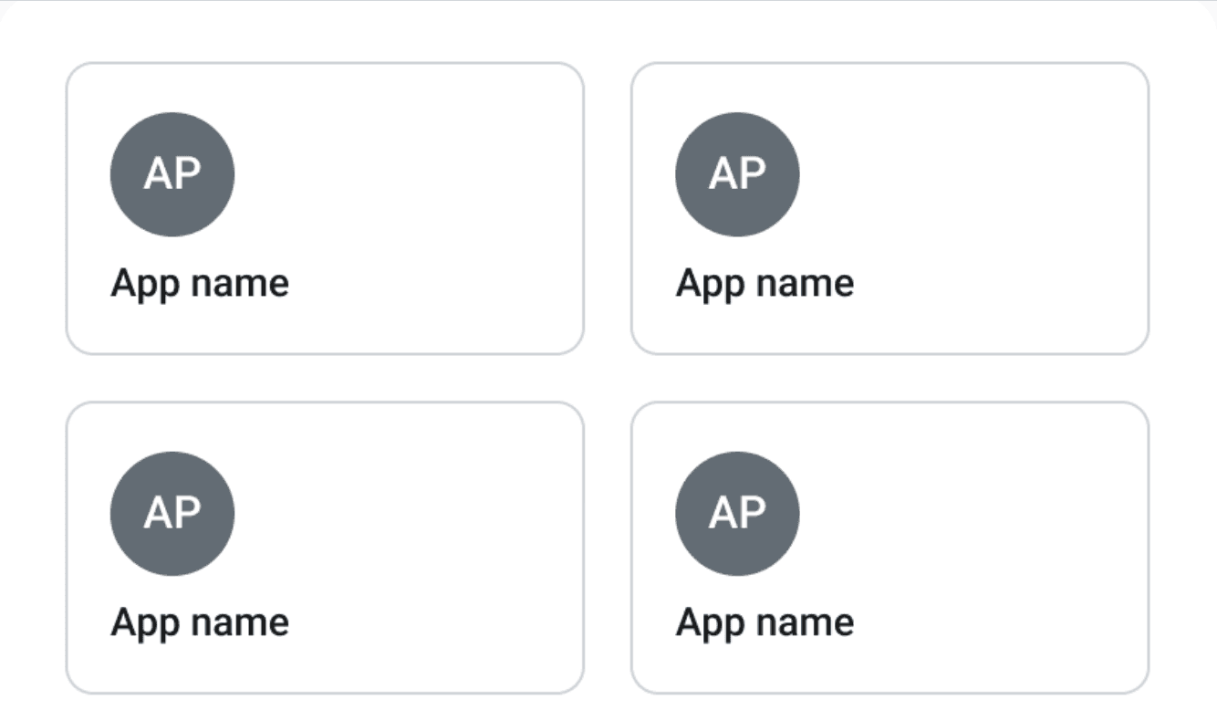
The Applications Portal Widget provides a place for users to access all of the Federated Applications they are associated with. The widget automatically displays only the apps that the user has access to.
The widget doesn't support custom flows for its underlying behavior.
import { ApplicationsPortal } from '@descope/react-sdk';

<ApplicationsPortal
	widgetId="applications-portal-widget"
	theme="light" // light / dark / os (auto detect)
    onReady={() => {
      console.log('Widget is ready');
    }}
/>
Opening Apps in a New Tab
By default, apps open in a new browser tab when a user clicks a tile. Open the Applications Portal Widget in the Widgets page of the Descope Console, select the apps list component, go to the Behavior tab, and toggle Open in New Tab off to open apps in the current tab instead.
Outbound Applications Widget
The Outbound Applications Widget provides a list of Outbound Applications a user is associated with, and allows them to connect to each of them directly from a widget.
The user will see outbound apps that are associated with their tenant, or available to the whole project, as well as whether or not they have already connected to the app.
You can embed the widget in your own app with the snippets below, or host it in the Admin Portal with no code. See Hosting the Widget in the Admin Portal.
You cannot modify any underlying behavior of the outbound applications widget components, as there are no default flows to modify.
import { OutboundApplications } from '@descope/react-sdk';

<OutboundApplications
	widgetId="outbound-applications-widget"
	theme="light" // light / dark / os (auto detect)
  form={{ myKey: 'myValue' }} // optional: forwarded to widget flows as {{form.myKey}}
  client={{ myKey: 'myValue' }} // optional: forwarded to widget flows as {{client.myKey}}
  onReady={() => {
    console.log('Widget is ready');
  }}
/>
Tenant Switcher Widget
The Tenant Switcher Widget lets signed-in users switch their active tenant when they are associated with multiple tenants. After a selection, the session reflects the chosen tenant (for example, the dct claim on the JWT), similar in effect to choosing a tenant with the Switch Tenant flow component.
Create the widget from the Tenant Switcher template on the Widgets page in the Descope Console, then pass that widget's ID to widgetId (the examples below use the template default tenant-switcher-widget).
You cannot modify any underlying behavior of the tenant switcher widget components, as there are no default flows to modify.

import { UserProfile } from '@descope/react-sdk';

<UserProfile
	widgetId="tenant-switcher-widget"
	theme="light" // light / dark / os (auto detect)
	styleId="" // optional style id
	onLogout={() => {
		// add here you own logout callback
		window.location.href = '/login';
	}}
/>