Containers
Containers are layout components that organize and position other elements on your Descope flow screens. Use them to group related components, control how those components are arranged, and apply background, border, and shadow styling.
Container Types
Descope offers two container components:
- Container: A standard container that lays out its children in a row or a column.
- Collapsible Container: A container with a title that users can expand and collapse, which is useful for keeping longer forms manageable.
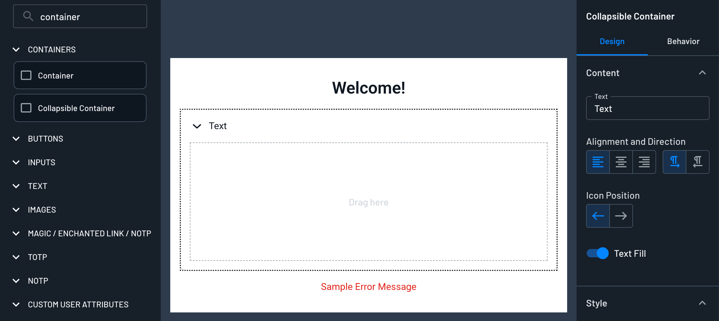
Components placed inside a container are its children. Select a container in the Screen Builder to configure it. A standard container has a Design tab holding a Layout and a Style section. A collapsible container adds a Content section for its title, along with a Behavior tab. The outermost container of a screen also has an Actions section for attaching a fraud prevention connector.
Layout
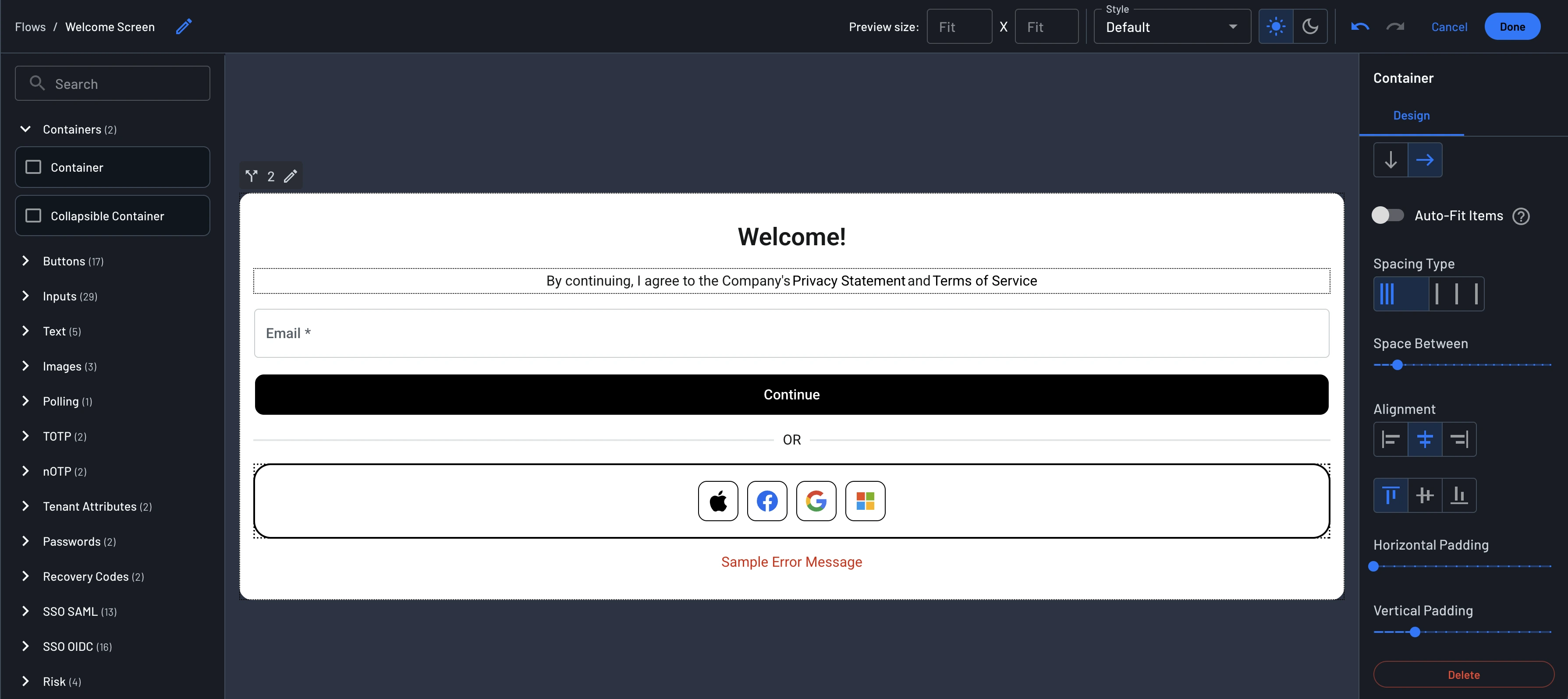
The Layout section controls the size of the container and the arrangement of its children.
- Width: The width of the container as a percentage of its parent.
- Direction: Lay children out in a row (horizontal) or a column (vertical).
- Auto-Fit Items: Available for row containers. Children share the container width and resize together. See Auto-Fit Items.
- Spacing Type: Shown for row containers. Choose Manual to set the gap yourself, or Auto to spread children across the full width of the container. This control is hidden while Auto-Fit Items is on.
- Space Between: The gap between children. Hidden when Spacing Type is set to Auto, since Descope calculates the gap.
- Alignment: Where children sit inside the container, as start, center, or end. A row container shows two rows of buttons here, the first for horizontal placement and the second for vertical.
- Horizontal Padding and Vertical Padding: The space between the edges of the container and its children.
Note
When you edit a widget, the widget's outermost container also has a Height setting: Auto adapts the height to the content, and Stretch fills the available height of the host element. This setting does not appear on the flow screens inside a widget.
Auto-Fit Items
By default, each component in a row keeps its own width, so a row of fixed-width components can wrap onto a second line or leave uneven gaps as the screen narrows. Turning on Auto-Fit Items makes the children of a row container divide the available width between them and resize together as that width changes.
Use it when you want two fields side by side, such as a first name and a last name input. With Auto-Fit Items on, the two inputs split the row evenly on a desktop browser and shrink together on a phone, instead of wrapping or leaving one field cramped.
To turn it on, select a container, set its Direction to row, and toggle Auto-Fit Items in the Layout section.
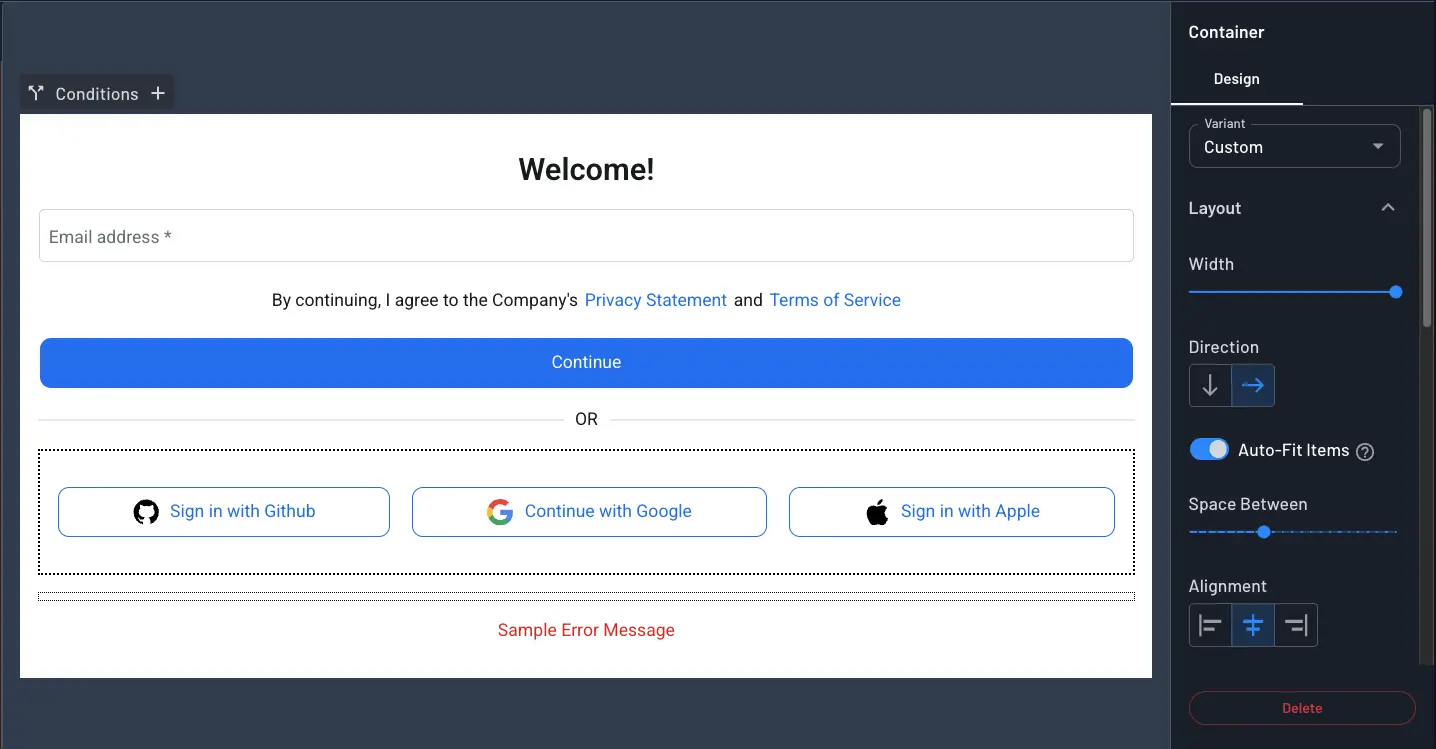
Auto-Fit Items is off by default, so existing screens keep the layout you already built.
Interactions with Other Settings
- Fill Container takes precedence: A child with Fill Container enabled still occupies the full width of the container, and Auto-Fit Items does not resize it to fit alongside its siblings. Turn Fill Container off on the components you want to share the row.
- Spacing Type is hidden: Turning on Auto-Fit Items switches the container to manual spacing and hides the Spacing Type control, because no leftover space remains to distribute. Space Between still applies and sets the gap between the children.
- Row containers only: The toggle appears for row containers, and collapsible containers do not have it. Turn Auto-Fit Items off before you switch a container to column direction, since the toggle disappears while the setting stays on.
Style
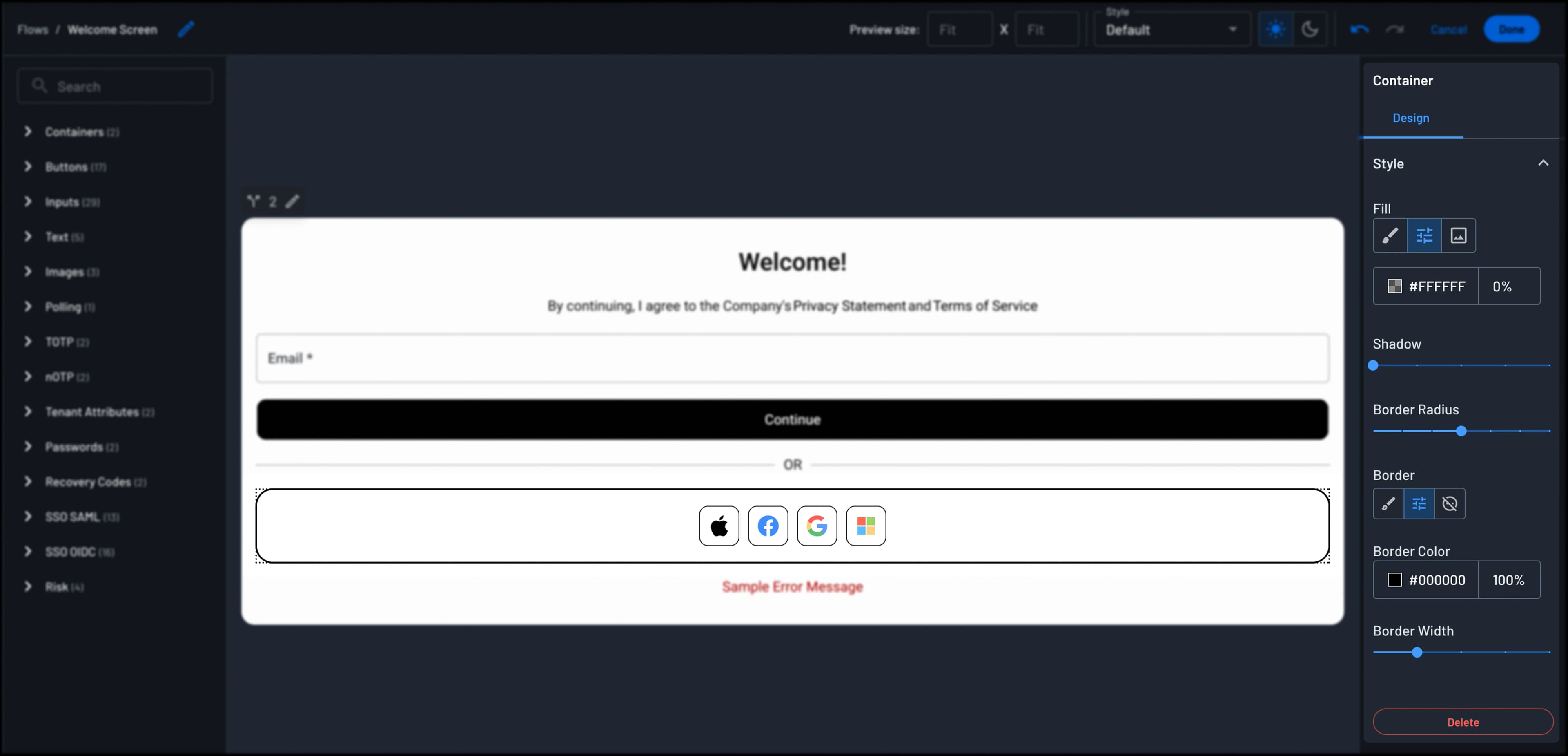
The Style section controls the appearance of the container itself.
- Fill: The container background. Choose a fill color based on your project Styles, a custom fill color, or a background image. The custom color picker includes an opacity value, so set that to 0% for a transparent container.
- Shadow: The drop shadow around the container, from none through several sizes.
- Border Radius: The corner rounding.
- Border: Choose a border based on your project Styles, a custom border, or no border. The custom option reveals Border Color and Border Width.
Variants
Containers other than the root container of the screen have a Variant selector above the Layout section. Pick a container variant defined in your project Styles to apply that shared look across every container using it. Selecting a variant hides the Style section and most of the Layout section, since the variant supplies those values, and leaves Width for you to set. Pick Custom to configure this one container by hand.
Note
When you edit this container from a widget's Widget Flows tab, the Width control and the Style section are hidden. This applies to flows used in the User Profile, Tenant Profile, User Management, and Outbound Applications widgets, whether or not a variant is selected.
Collapsible Containers
A collapsible container adds a clickable title row that expands and collapses its contents.
The Content section of the Design tab configures that title row:
- Text: The title shown on the container.
- Alignment and Direction: The alignment of the title text, and its text direction for right-to-left languages.
- Icon Position: Whether the expand and collapse icon sits to the left or the right of the title.
- Attach icon to text: Keeps the icon next to the title text rather than at the edge of the container.
- Text Fill: Stretches the title text to fill the width of the title row.
The Style section starts with two selectors for the title text: Style picks a typography level from H1 through Body2, and Color picks Primary or Secondary. Below those sit the container Fill, Shadow, Border, and Border Radius. Here Border is a simple on/off toggle, unlike the three-way control found on a standard container.
The Layout section has Width, Space Between, Horizontal Padding, and Vertical Padding. A collapsible container always stacks its children in a column.
The Behavior tab holds one setting, Open by default, which controls whether the container is expanded the first time a user sees the screen.