Images and Logos
This guide covers the design configurations for image and logo components in Descope flow screens. These components let you display your brand's logo, a connected app's logo, or any other custom image.
Add them by dragging a component from the Images category in the left panel into your flow screen.
The Images category includes three components: Image, Logo, and Inbound App Logo.
Image
The Image component displays a static image that you upload directly to the component.
Content
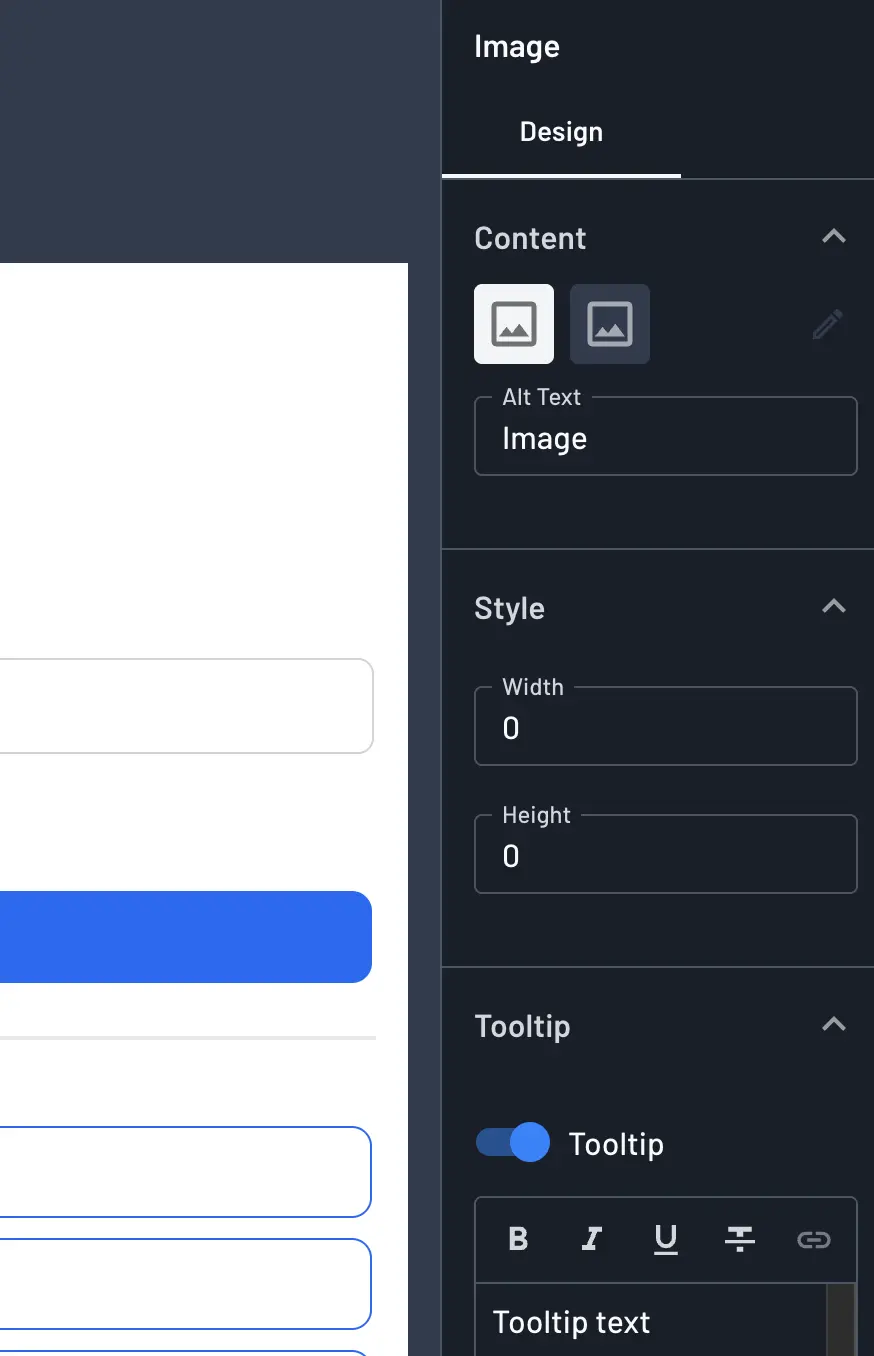
Selecting an Image component shows a light mode and dark mode preview side by side. Click the pencil icon to open the upload dialog.
- The first image you upload is applied to both light and dark mode.
- If you then upload a second image, it's assigned only to the mode you uploaded it to, letting the image differ between light and dark themes.
You can also set the Alt Text for the image using the Alt Text field, which is used for accessibility and screen readers.
Style
- Width: The width of the image, in pixels.
- Height: The height of the image, in pixels.
Tooltip
You can enable a tooltip on an Image component so that extra text-based context appears on hover. Toggle Tooltip on, then enter the tooltip text, position, and optional hover/hide delays.
For more on configuring tooltips, see the Tooltip section in the Buttons guide.
Logo
The Logo component displays your project's configured brand logo rather than an image you upload per-component.
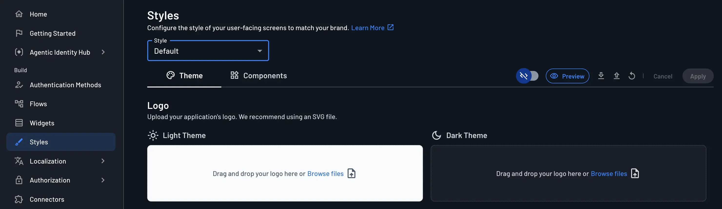
The logo itself is set once for the whole project in the Descope Console under Styles > Theme > Logo, where you can upload separate light and dark theme versions (SVG recommended). Every Logo component you add to a screen automatically reflects that project-wide logo.
Like the Image component, a Logo component exposes:
- Alt Text: Accessibility text for the logo.
- Style: Width and Height, in pixels.
- Tooltip: Same tooltip options as described above.
Note
To change the actual logo image shown by every Logo component across your project, update it in the Styles section, rather than in the individual component.
You can also override the logo via code mode using the --descope-logo-url and --descope-logo-fallback-url variables.
Inbound App Logo
Note
If you're using a common agent, such as Claude or ChatGPT, the logo should automatically appear when authenticating a user.
The Inbound App Logo component is used within OAuth consent screens involving Inbound Apps and Agentic Client.
It displays both logos side by side—the logo of the Agentic Client or Inbound App requesting access and your project's logo—connected by a bidirectional arrow icon that visually represents the link being made between the two.
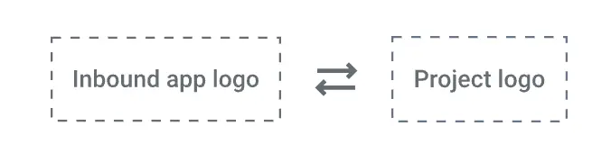
The Inbound App Logo component exposes a Style section with a Size slider that lets you adjust the size of both logos simultaneously.
The component automatically scales the logos to fit within the available space while maintaining their aspect ratios.