Styles
Styles help you create and scale user-facing screens while adhering to your brand's guidelines. You can add your brand's logo, colors, fonts, and other design elements in a central location through the Styles Page of the Descope Console.
Any screens you create with the Screen Builder will take on the brand elements from your pre-defined styles.

Creating and Managing Styles
To manage styles:
- Navigate to the Styles tab in your Descope Console.
- Click the dropdown and select
+ New styles fileto create a new style.
Creating a New Style
- Give your style a unique name—this automatically generates a corresponding Style ID.
- Click
Addto create the new style in your project.
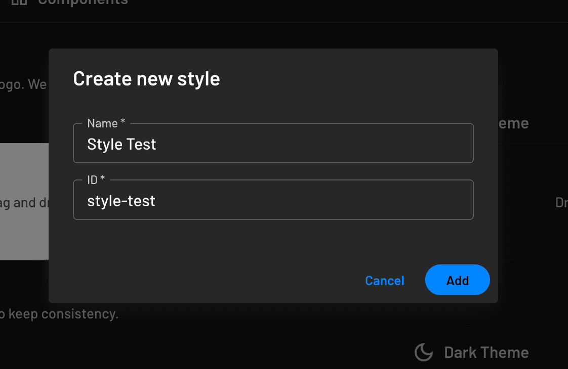
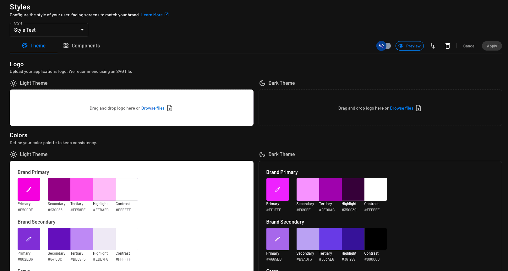
You can now customize the style using the GUI or Code Mode, adjusting any UI component's appearance.
Based on your primary and secondary color selections, Descope automatically generates a full color palette.
Deleting a Style
If a style is no longer needed, simply delete it using the delete icon next to the file.

Styles Per Application
If you want to customize the styling for the same flow based on the application rendering the flow, you can do that in one of two ways:
Using the Descope SDKs
Please refer to our Descope SDK documentation for more details on other frameworks.
You can pass the styleId parameter into the component like this:
<Descope
  flowId="sign-up-or-in"
  styleId={"style-id"}
/>
This allows you to use a single flow across multiple branded applications, with a custom style in each.
To override only primary and secondary colors at runtime (without a separate style file), use themeOverride on the flow component.
Using Auth Hosting
This is typically relevant for customers using Descope with Federated Apps, Inbound Apps, or MCP Servers.
You can read more about how to configure a custom style using Auth Hosting, on our docs here.
Within the Console
Within the Console, Descope has Styles divided into two tabs. Under the Theme tab, you'll see all the global styling options that affect the overall screens and individual components. Under the Components tab, you can configure each individual component type in detail.
Styling Themes
Under the Theme tab, we have three sections that we can customize according to our brand. Each of these sections are available for both Light and Dark themes.
Logo
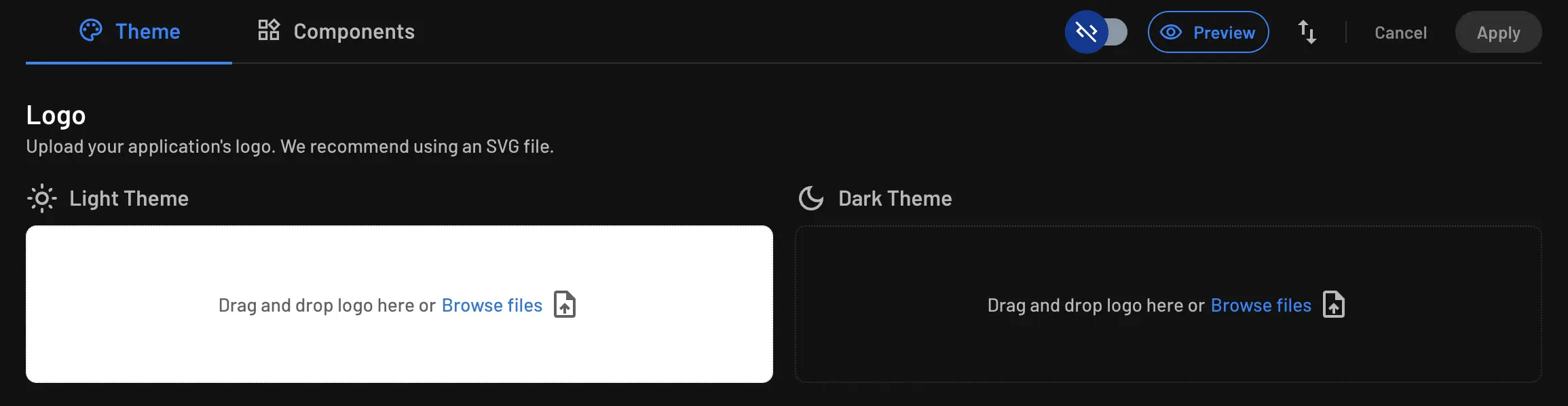
You can upload your company's logo under this field with a simple drag and drop. Same goes for the dark theme option as well.
Favicon
Note
This option is only available for SSO Setup Suite themes.
You can upload your company's favicon under this field with a simple drag and drop. Same goes for the dark theme option as well.

Colors
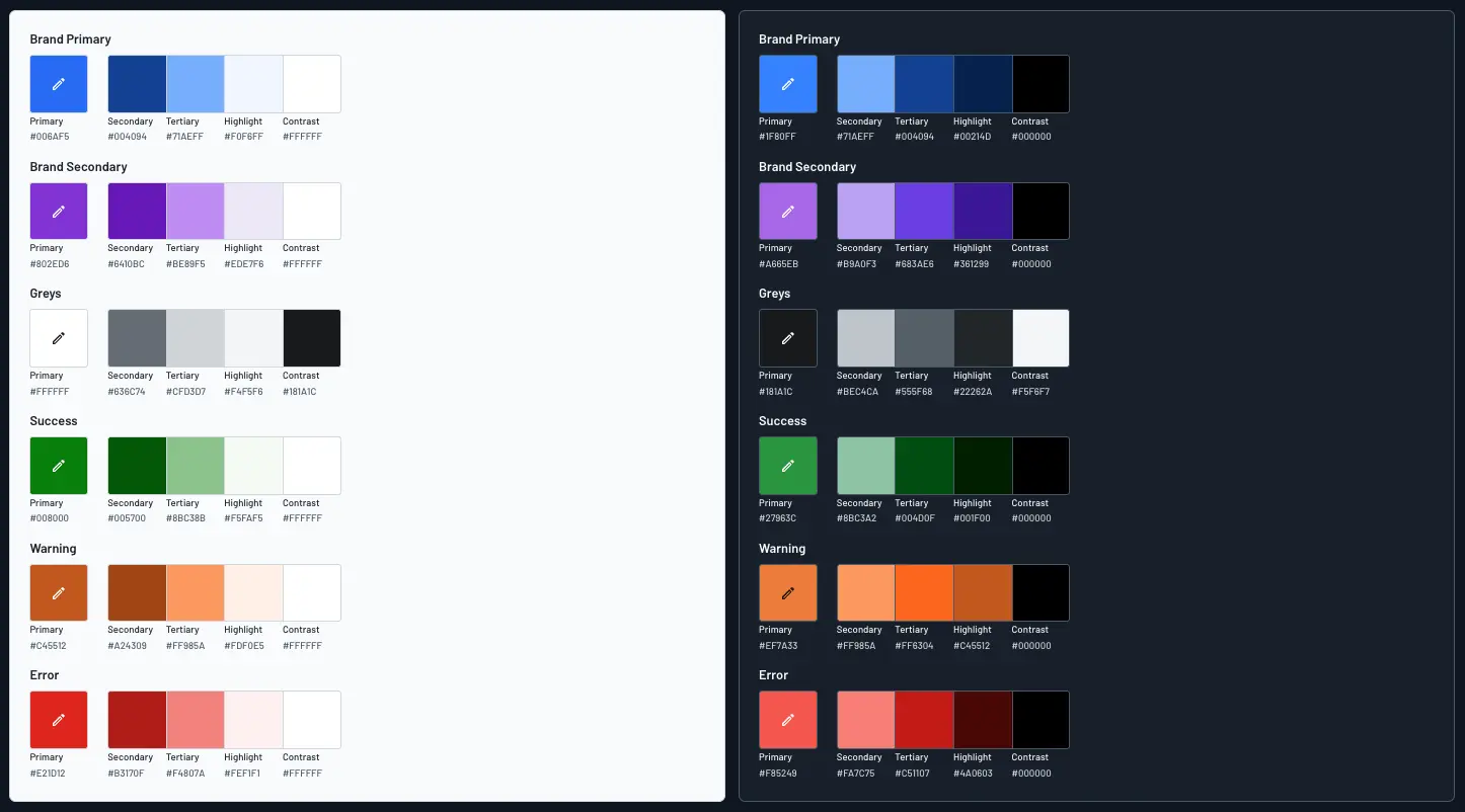
In this section, you can select your brand colors to match brand consistency. You have options of designing Primary, Secondary, Greys, Success, Warning, and Error color palettes.
When you select a primary color for example, Descope will create the rest of the palette for you.
Typography
In this section, you choose primary and secondary font families, then define styling for text-typed components used in Flow screens.
Under Font 1 and Font 2 (optional), select a font family from the dropdown. You can also add a custom font; see Custom Fonts below.
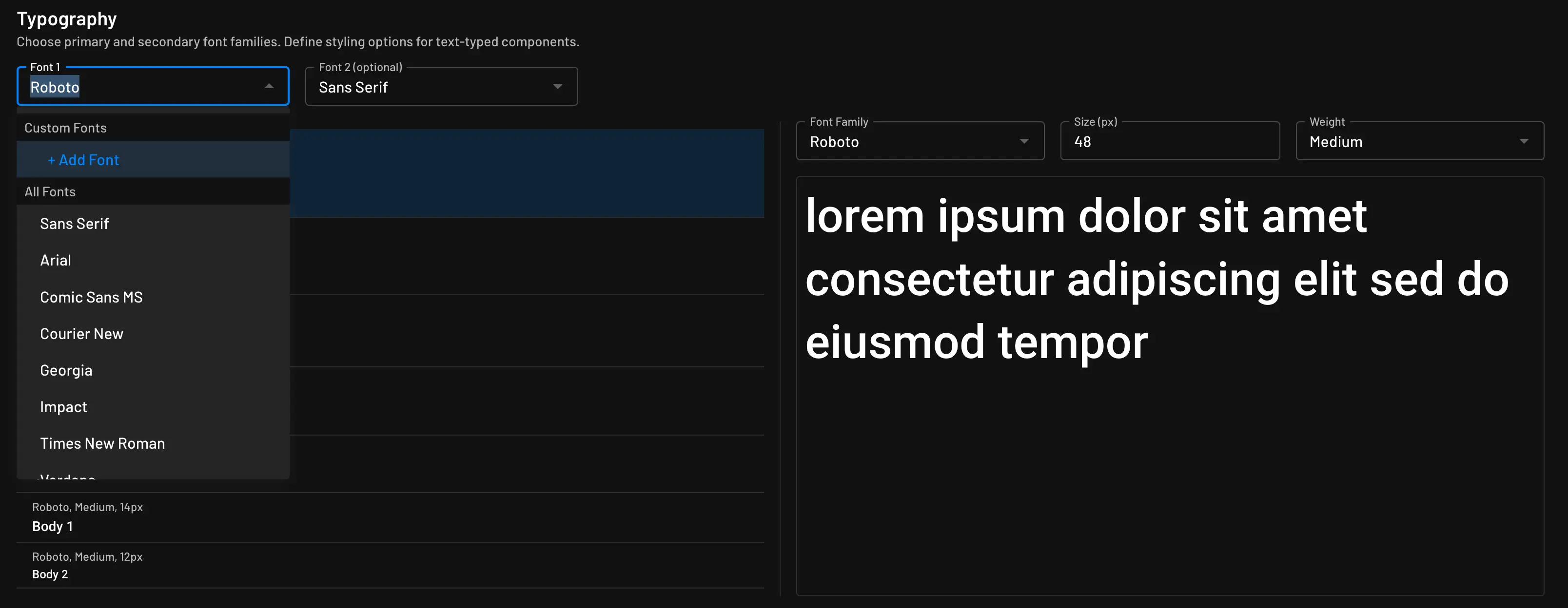
Below the font family selectors, you'll see pre-configured text styles:
- Heading 1, Heading 2, Heading 3
- Subtitle 1, Subtitle 2
- Body 1, Body 2
These are the stylized text options available in Flow screens—for example, when using the text component. On the left, you see a preview of each style. On the right, you can override any pre-configured setting with your own Font Family, Size (px), and Font Weight.
Font Weight offers nine named increments, each mapped to a standard CSS font-weight value:
| Label | CSS font-weight |
|---|---|
| Thin | 100 |
| Extra Light | 200 |
| Light | 300 |
| Regular | 400 |
| Medium | 500 |
| Semi Bold | 600 |
| Bold | 700 |
| Extra Bold | 800 |
| Black | 900 |
Custom Fonts
Note
Custom fonts must be hosted on a publicly accessible URL to be used in your Descope styles.
Each font family allows one custom font setting. To configure a custom font, click + Add Font from the font dropdown, then provide a label name (for example, "My Custom Font") and a URL to a CSS file that contains font file URLs. You can edit the custom font after it has been set.
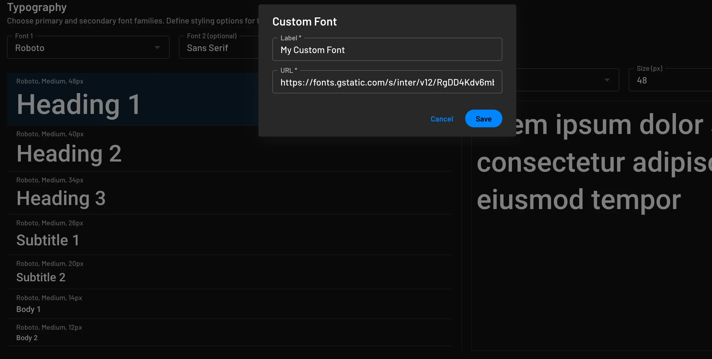
The uploaded file must be a CSS file that defines @font-face rules. Each font face should specify the font's name, weight, source files, and any other attributes it needs.
The CSS file can include multiple font faces, such as variations of the same font with different weights. The font-family value must match the custom font name you configured in Descope.
Any valid MDN @font-face declaration is supported. You can use one or multiple CSS files for font face declarations.
Shown below is an example style.css for a custom font named 'Roboto Mono' with regular and bold+italic styles:
@font-face {
  font-family: 'Roboto Mono', monospace;
  src: url(fonts/roboto-mono-v12-latin-regular.woff2) format('woff2'),
       url(fonts/roboto-mono-v12-latin-regular.woff) format('woff'),
       url(fonts/roboto-mono-v12-latin-regular.ttf) format('truetype');
}

@font-face {
  font-family: 'Roboto Mono', monospace;
  src: url(fonts/roboto-mono-v12-latin-700italic.woff2) format('woff2'),
       url(fonts/roboto-mono-v12-latin-700italic.woff) format('woff'),
       url(fonts/roboto-mono-v12-latin-700italic.ttf) format('truetype');
  font-weight: 700;
  font-style: italic;
}
Styling Components
Under the Components tab, you can style individual UI components in more detail. Every component has editable options on the right side.
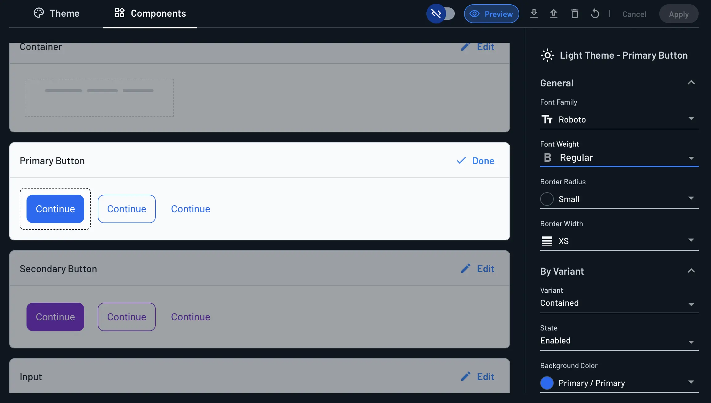
Many components group their options into a General section (options that always apply) and a By Variant or By State section (options you can override for a specific variant or state—for example, styling only the Enabled state of a component, or only the Primary Text variant). Select the variant or state you want to customize from its dropdown before editing the fields below it.
Once all the changes are made, click Apply, then use Preview to review your changes.
Root Container
Style:
- Background Color: The fill color of the screen's outer container.
- Border Radius: The roundness of the container's corners.
- Border: Toggle whether the container has a border. When enabled, you can set the border's color and width; when disabled (the default), the container has no border.
Primary Buttons
General:
- Font Family: The font used for the button's text.
- Font Weight: The weight (boldness) of the button's text.
- Border Radius: The roundness of the button's corners.
- Border Width: The thickness of the button's border.
By Variant, configured per Variant (e.g. Contained) and State (e.g. Enabled)—select a variant and state, then set:
- Background Color: The fill color of the button for the selected variant and state.
- Border Color: The border color of the button for the selected variant and state.
- Text Color: The text color of the button for the selected variant and state.
Note
Secondary Buttons share the same set of style options as Primary Buttons.
OAuth Buttons
You can customize each default OAuth sign-in button independently of one another. As an example, for just the Apple OAuth login button, you can override the button styling or leave the defaults:
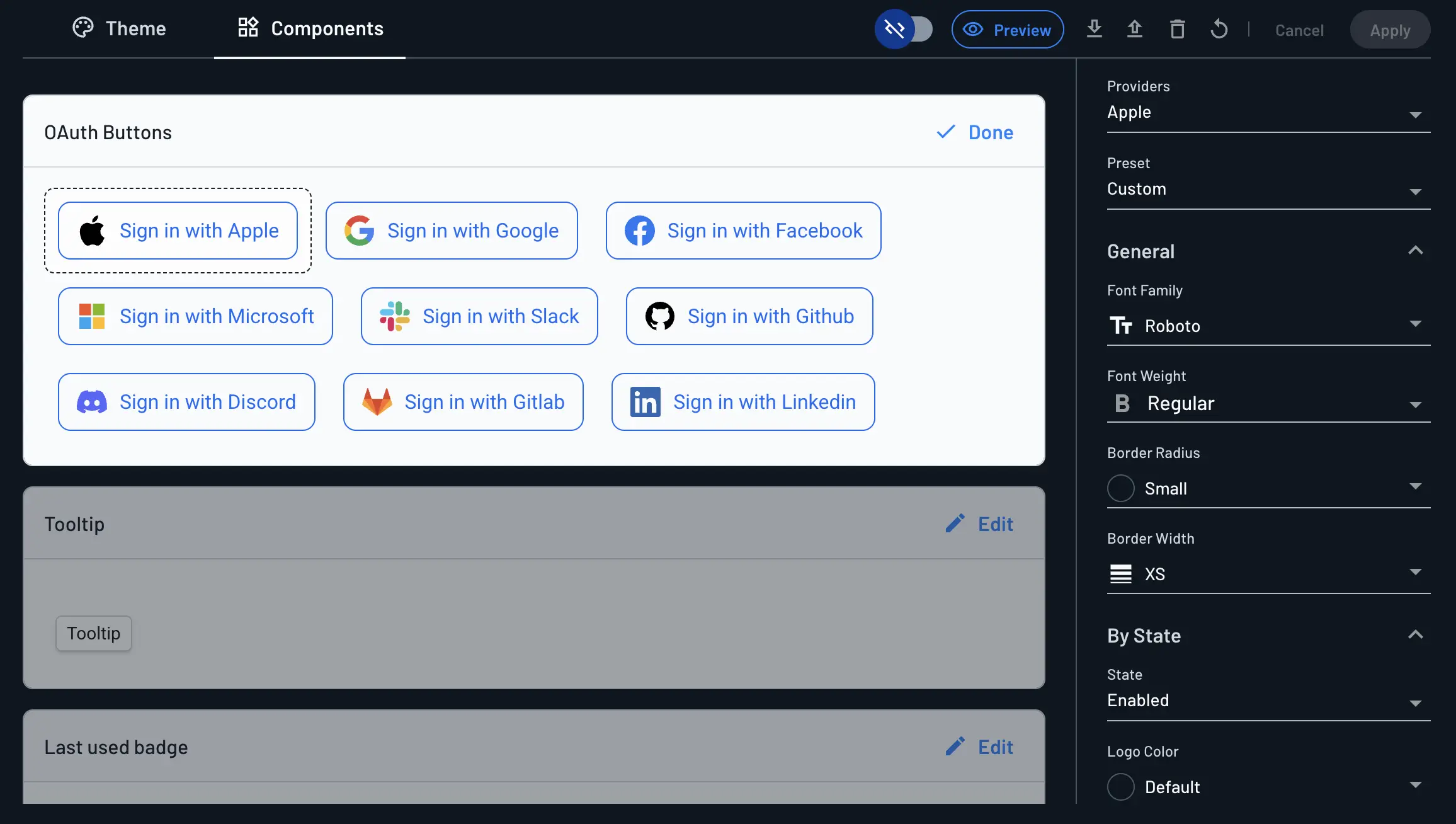
By Variant:
- Providers: The OAuth provider whose button you want to style (e.g.
Apple,Google,Facebook). - Preset: Choose a predefined style, or
Customto override the button's styling for the selected provider.
General:
- Font Family: The font used for the button's text.
- Font Weight: The weight (boldness) of the button's text.
- Border Radius: The roundness of the button's corners.
- Border Width: The thickness of the button's border.
By State (e.g. Enabled)—select a state, then set:
- Logo Color: The color of the provider's logo icon on the button.
- Background Color: The fill color of the button for the selected state.
- Border Color: The border color of the button for the selected state.
- Text Color: The text color of the button for the selected state.
Input
- Font Family: The font used for the input's label and value text.
- Font Weight: The weight (boldness) of the input's text.
- Border Radius: The roundness of the input's corners.
- Border Width: The thickness of the input's border.
- Background Color: The fill color of the input field.
- Label Color: The color of the input's label.
- Value Color: The color of the text the user enters into the input.
- Error Message Font Size: The font size of the validation error message shown below the input.
Labels
General (applies to the component regardless of variant or state):
- Font Family: The font used for the label's text.
- Border Radius: The roundness of the label's corners.
- Border Width: The thickness of the label's border.
By Variant, configured per State (e.g. Enabled)—select a state, then set:
- Background Color: The fill color of the label for the selected state.
- Border Color: The border color of the label for the selected state.
- Text Color: The text color of the label for the selected state.
Radio Group
General:
- Font Family: The font used for the option labels.
- Font Weight: The weight (boldness) of the option labels.
- Label Color: The color of the text label next to each radio option.
- Option Color: The color of the radio button's outer circle (the unselected ring).
- Background Radio Color: The fill color behind the radio button.
By State (e.g. Default): select a state to override any of the options above just for that state.
Text
By Variant (e.g. Primary Text)—select which text variant you want to style, then set:
- Text Color: The color of the text for the selected variant.
Tooltip
- Font Family: The font used for the tooltip's text.
- Size (px): The font size of the tooltip's text, in pixels.
- Font Color: The color of the tooltip's text.
- Font Weight: The weight (boldness) of the tooltip's text.
- Border Radius: The roundness of the tooltip's corners.
- Border Width: The thickness of the tooltip's border.
- Padding: The internal spacing between the tooltip's border and its text, set independently for horizontal and vertical spacing.
- Background Color: The fill color of the tooltip.
- Border Color: The color of the tooltip's border.
- Shadow: The size of the drop shadow behind the tooltip.
Last Used Badge
- Font Family: The font used for the badge's text.
- Font Weight: The weight (boldness) of the badge's text.
- Size (px): The font size of the badge's text, in pixels.
- Text Color: The color of the badge's text.
- Border Radius: The roundness of the badge's corners.
- Border Width: The thickness of the badge's border.
- Padding: The internal spacing between the badge's border and its content, set independently for horizontal and vertical spacing.
- Background Color: The fill color of the badge.
- Border Color: The color of the badge's border.
- Shadow: The size of the drop shadow behind the badge.
Code Mode
Styles between light and dark theme will not persist, meaning each theme holds different values.
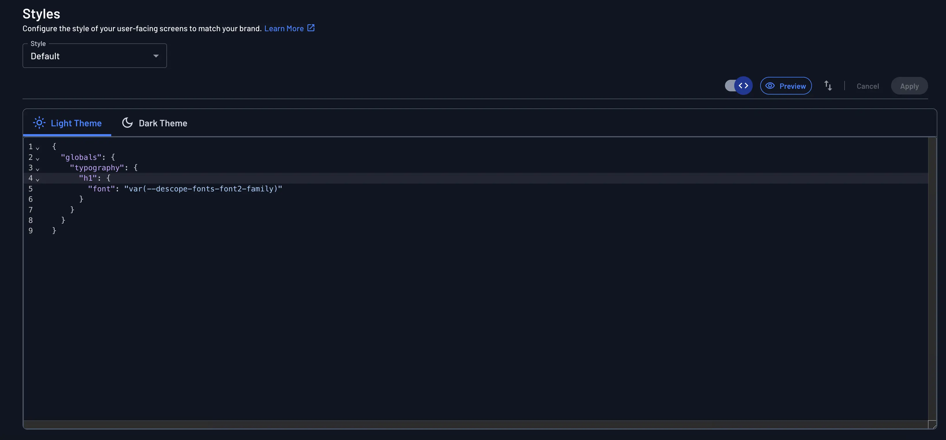
Enable code mode editor with a toggle button. Clicking the button will switch the styles page to code mode:

Code mode allows you to view or edit the styled theme in a code-first approach. For ease of use, code mode will only show the fields that have been changed from Descope's default style. For example, to edit the Font Family in Code Mode, we can first change it to Sans Serif in the GUI:
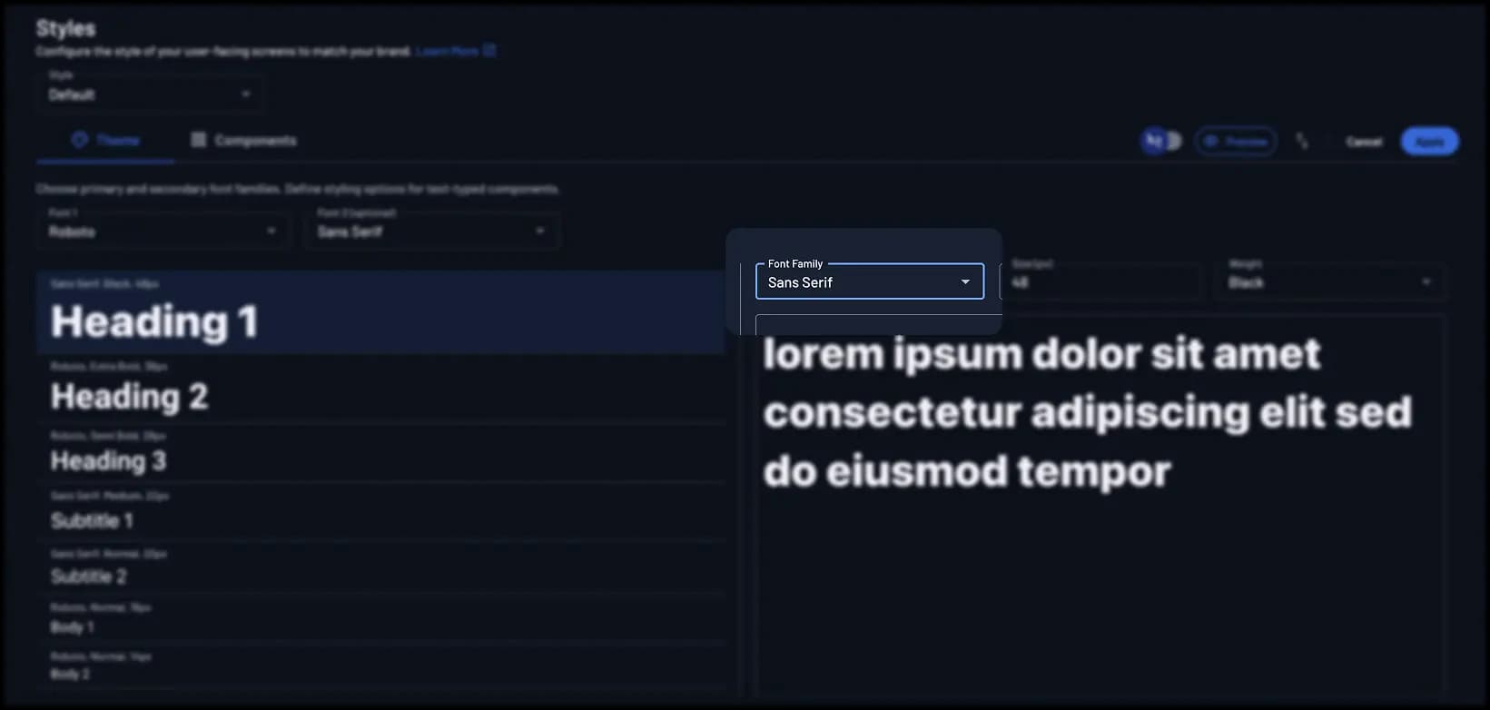
The keys pertaining to Font Family will now be visible in Code Mode, and can be modified directly from there:
For the full set of globals and components keys available in Code Mode, see the Globals Reference and Components Reference. For specific worked examples, refer to our Advanced Styling Examples Doc.
Managing Themes from the Console
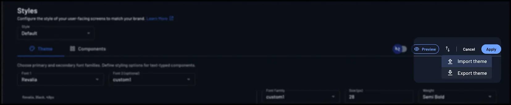
Once you have defined your styles, you can export or import the styles using the Export theme and Import theme buttons at the top right of the styles page.
This feature allows you to backup your current styles, or migrate them between your projects.
Note
You can also revert back to the default Descope styling with the Reset to default button.