Inputs
Inputs are form components that can be pre-built fields like email or given name, or custom input fields for user attributes. This section covers the available configuration options for input components.
Note
When a field is marked mandatory, there is a generic "Missing Value" error message that can be translated within the Localization section of the Descope Console.
Design
Label
The label is the text displayed above the input field. You can customize this text or leave it empty to hide the label.
Placeholder
The placeholder is the hint text displayed inside the input field. You can customize this text or leave it empty to have no placeholder. The placeholder disappears when the user starts typing.
Allow Copying Value
Enable the Allow copying value setting to display a copy icon next to the input field. Users can click this icon to copy the input value to their clipboard.
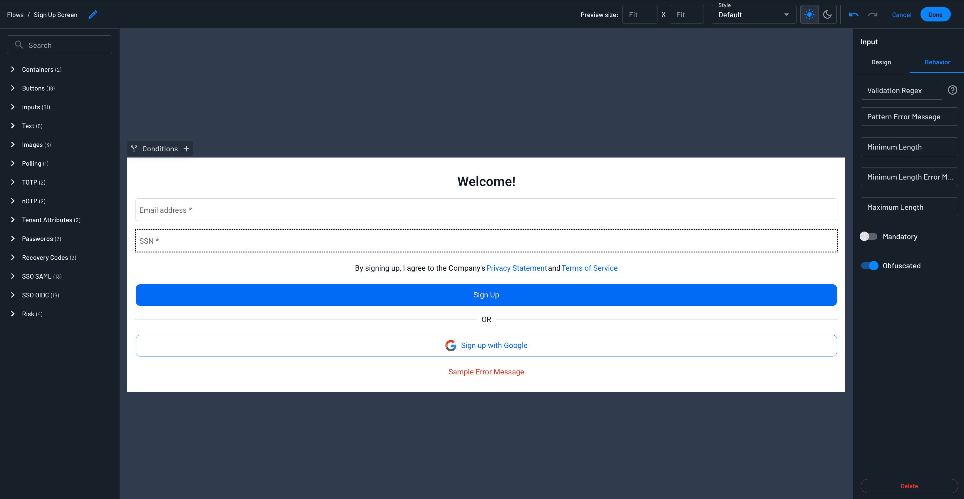
Obfuscated Text Input
Enable the Obfuscated setting under Behavior to mask sensitive non-password information and protect it from "over-the-shoulder" viewing. You can use this component to collect SSN, Tax ID Numbers (EIN, TIN), Account Numbers, or any other Personal Identifiable Information (PII).
Behavior
Validation Regex
You can configure a regex pattern to validate the input data format. This is useful for ensuring specific formats, lengths, or character restrictions.
For example, to allow only letters (no numbers or special characters), use the pattern ^[A-Za-z]+$. This will reject any input that contains numbers or special characters.
Pattern Validation Error Message
You can configure a custom validation error message to display when the regex pattern validation fails. This message will appear instead of the default validation error.
Note
When this message is configured, you can translate the message within the Localization section of the Descope Console.
Minimum Length
The minimum number of characters required in the input field.
Minimum Length Validation Error Message
You can configure a custom validation error message to display when the minimum length requirement is not met. This message will appear instead of the default validation error.
Maximum Length
The maximum number of characters allowed in the input field.
Mandatory
When enabled, this field becomes required and must be filled out before the user can proceed to the next step in the flow. An asterisk will appear next to the field label to show it's required.

Errors On Blur vs On Submission
On Submission
By default, input validation uses On Submission mode, which means error messages only appear when the user attempts to submit the form. All validation errors will be displayed under their respective fields after submission. Errors disappear immediately when the user enters valid input, regardless of whether you use On Blur or On Submission mode.

On Blur
On Blur mode displays error messages immediately when a user clicks out of an input field if the input is invalid. This provides instant feedback and allows users to fix errors immediately. To enable On Blur mode, pass the validateOnBlur prop as true in your Descope Component.
import { Descope } from '@descope/react-sdk'

const App = () => {
    return (
        {...}
        <Descope
            flowId="my-flow-id"
            onSuccess={(e) => console.log('Logged in!')}
            onError={(e) => console.log('Could not logged in')}
            validateOnBlur={true}
        />
    )
}