Month / Day
Use this component when you need to collect a month and day from the user, such as a birthday, without asking for the year.
Screen Builder
Create a new screen (or edit an existing screen) inside a flow and search for "Month / Day" input component:
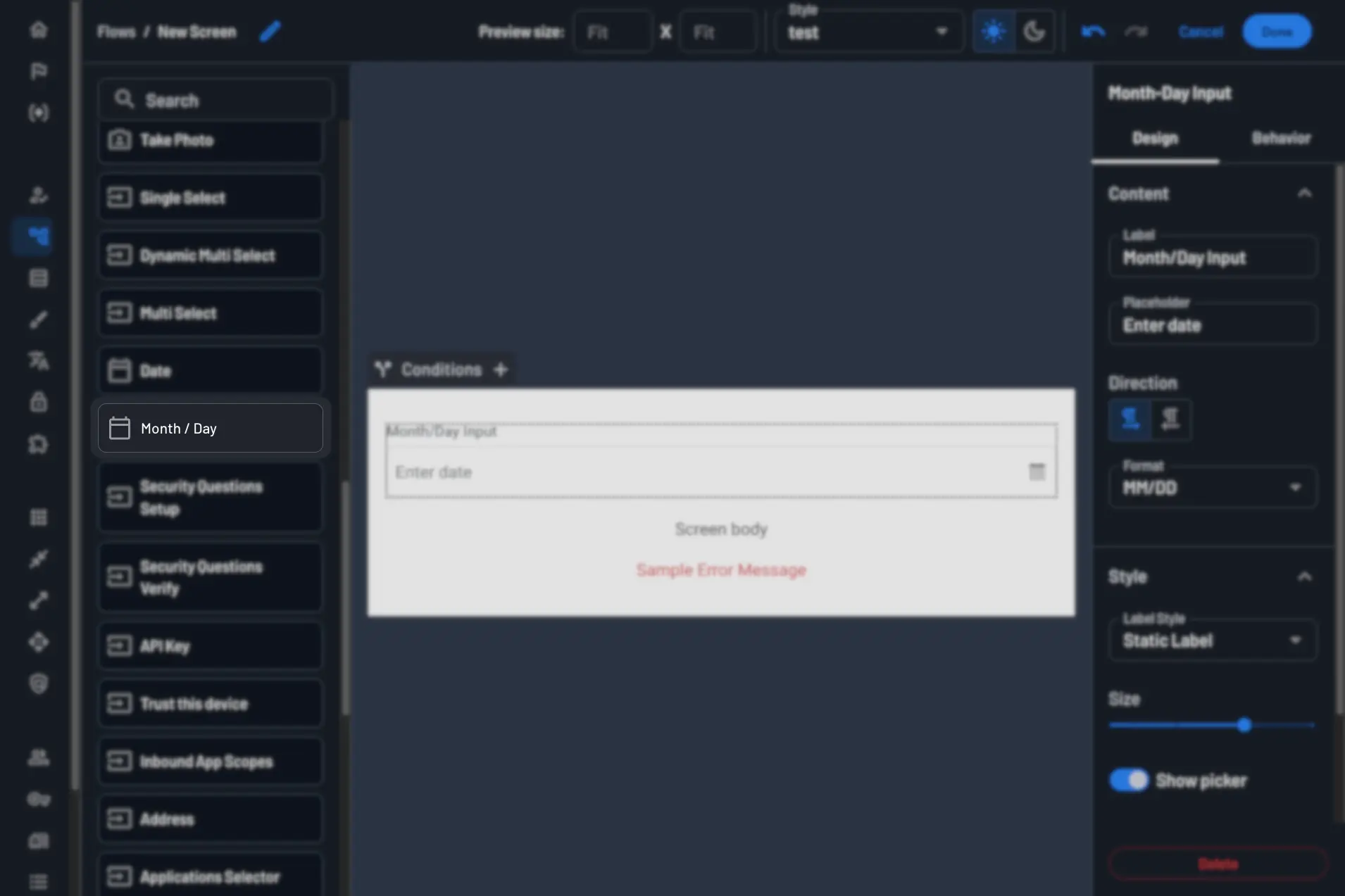
Options Overview
- Label: The label will be presented to the customer right above the component.
- Placeholder: A text that will be displayed inside the input component as a placeholder. Example: Birthday
- Direction: Text Direction (left to right/right to left).
- Format: The format of the value. The options are:
MM/DD,DD/MM - Label Style: You can select from these options: Static Label or Floating Label.
- Size: The size of the text value inside the component.
- Show Picker: A toggle to show/hide the picker.
- Fill container: Stretch to fit the container.
- Context Key: The answer will be populated as a value inside a context key under
form. - Mandatory (Behavior Tab): Determines if the user must select a value to continue to the next step.
Usage
The month/day component gives users two dropdowns: one for the month, one for the day. When a user selects a month, the day options change to match how many days that month has, so they can't submit an invalid date like February 30th.
This component works well for birthday-based promotions or loyalty programs, where customers may hesitate to share a full date of birth.
Set a context key on the component, and reference the user's input later in the flow using that key.
Note
The picker is optional. Users can also type a value directly.